.avif)
Streamlining multi-brand management through a shared design framework
Overview
Rocky Brands is a heritage company with nine distinct footwear brands, each with its own audience, identity, and tone.
As part of Diff's design team, I helped create and adapt a Shopify Framework into scalable, brand-specific storefronts, ensuring each felt unique while maintaining consistency and performance across the ecosystem.
(eCommerce agency)
Creative Director
Developer
Project Manager
Shopify
Jira
Brief
Rocky Brands’ legacy Salesforce system created operational bottlenecks. Content updates were slow, managing multiple storefronts was inefficient, and maintaining a cohesive UX was nearly impossible.
Rocky Brands’ legacy system made it difficult to update content, manage multiple brands, and maintain a consistent user experience. The new Shopify architecture provided the foundation for efficiency, but design-wise, we needed to ensure each brand’s personality came through.
.avif)
Impact

Reusable system powering nine unique brands

Consistent UX across the entire ecosystem

Stronger accessibility standards
Project Goals
Agency goal
Designer goal
User goals
Foundation
We started off by building out modular Shopify blocks, for hero banners, product grids, and content sections.
These formed the backbone of every brand experience. Before applying any brand styles, I familiarized myself with how each block behaved across breakpoints and identified the opportunities for customization within typography, color, and imagery.
The Challenge
Designing within a shared Shopify framework meant working within strict boundaries.
Each sub-brand came with its own visual language, yet all needed to fit within the same system. The design challenge was finding a balance between structure and expression, making every site feel intentional and on-brand without breaking scalability.
Color hierarchy and CTA states
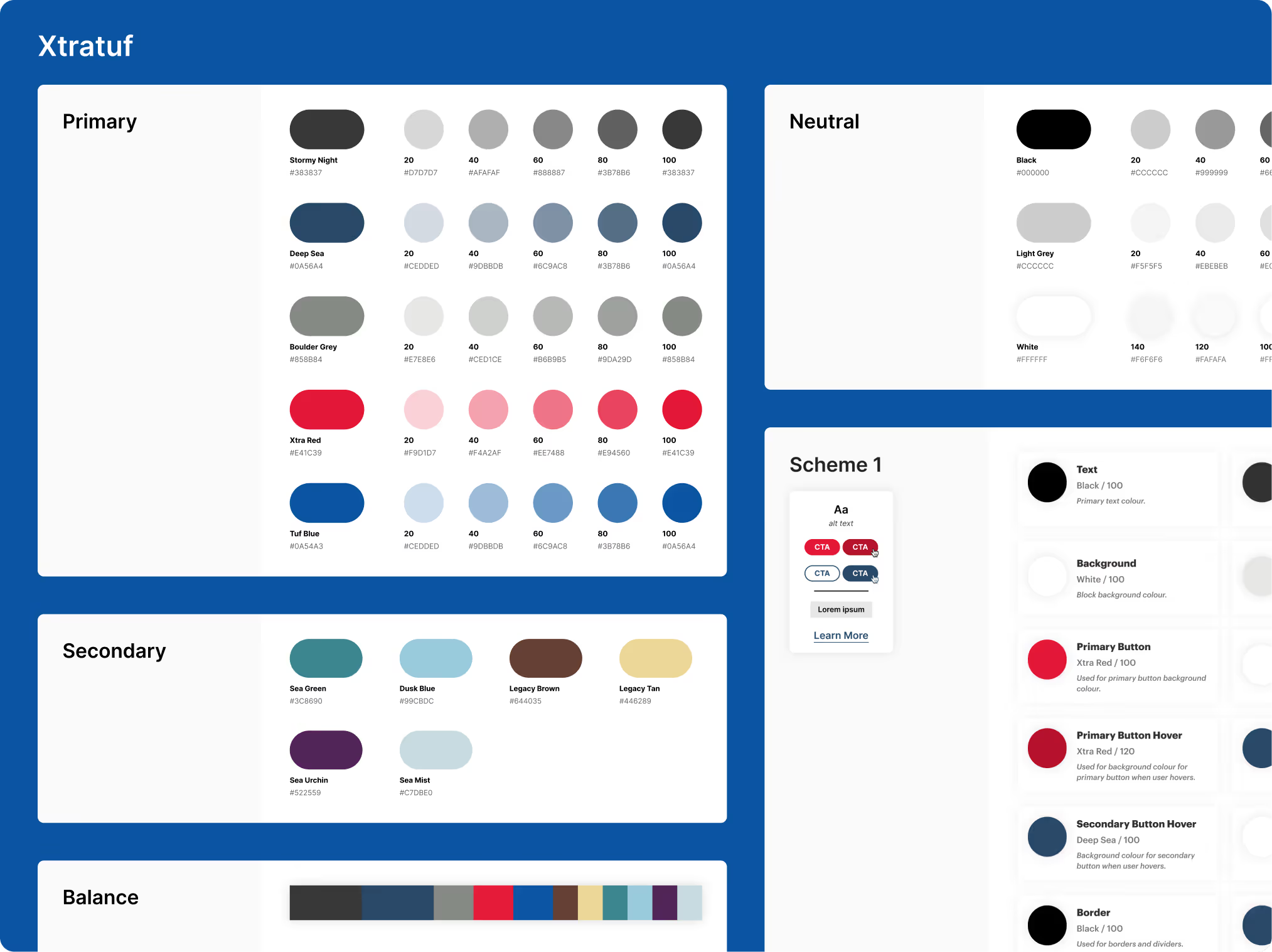
Each brand used a different color palette and emotional tone. I developed color hierarchies for primary, secondary and hover states to ensure clarity across interactions.
Typography and visual hierarchy
I adjusted font weights, spacing, and typographic hierarchy to align with each brand’s content density and visual rhythm, maintaining clarity across varying layouts.
Curating and aligning imagery
Sourced, selected, and refined photography to match each brand’s story and environment.
Accessibility
I tested contrast ratios across brand palettes and proposed accessible color alternatives when needed to ensure a consistent, inclusive experience across brands.
Execution
Although all brands drew from the same set of Shopify blocks, the layouts weren't replicated.
My role was to curate and arrange the blocks in a way that suited each brand’s content and personality, ensuring every site felt distinct and intentional.
This approach allowed Muck Boot Company’s site to feel grounded, warm, and tactile, while XTRATUF’s layout leaned into cooler tones, bolder contrast, and a more performance-driven look.
Scalability
Because the templates were shared, each design decision needed to scale across breakpoints. I worked on mobile-first adaptations, ensuring that key conversion elements (add-to-cart, product details, etc.) remained accessible and visually clear.
Defining Success
Success meant more than aesthetic differentiation, it meant creating a system that scaled. By the end of the project, the team successfully launched fully branded storefronts for the 9 brands, built from the same shared framework yet visually distinct.
With their new platform and design system, Rocky Brands can now manage nine distinct brands from a single, cohesive system, launching faster, maintaining consistency, and scaling with ease.
Reflection
This project reminded me that eCommerce design isn’t about starting from a blank canvas. There are patterns that work, and shoppers rely on them. I had to respect those standards while still shaping each brand’s personality inside a shared Shopify system. It pushed me to be more intentional about structure, scale, and usability.
.avif)
.avif)

.avif)
.avif)


.avif)
.avif)


.avif)
.avif)